
“Does money buy happiness?” is debated for individuals, but across countries the pattern is clearer: richer countries tend to report higher life evaluations. Income supports basics like healthcare, education, and stability—reducing day-to-day insecurity.
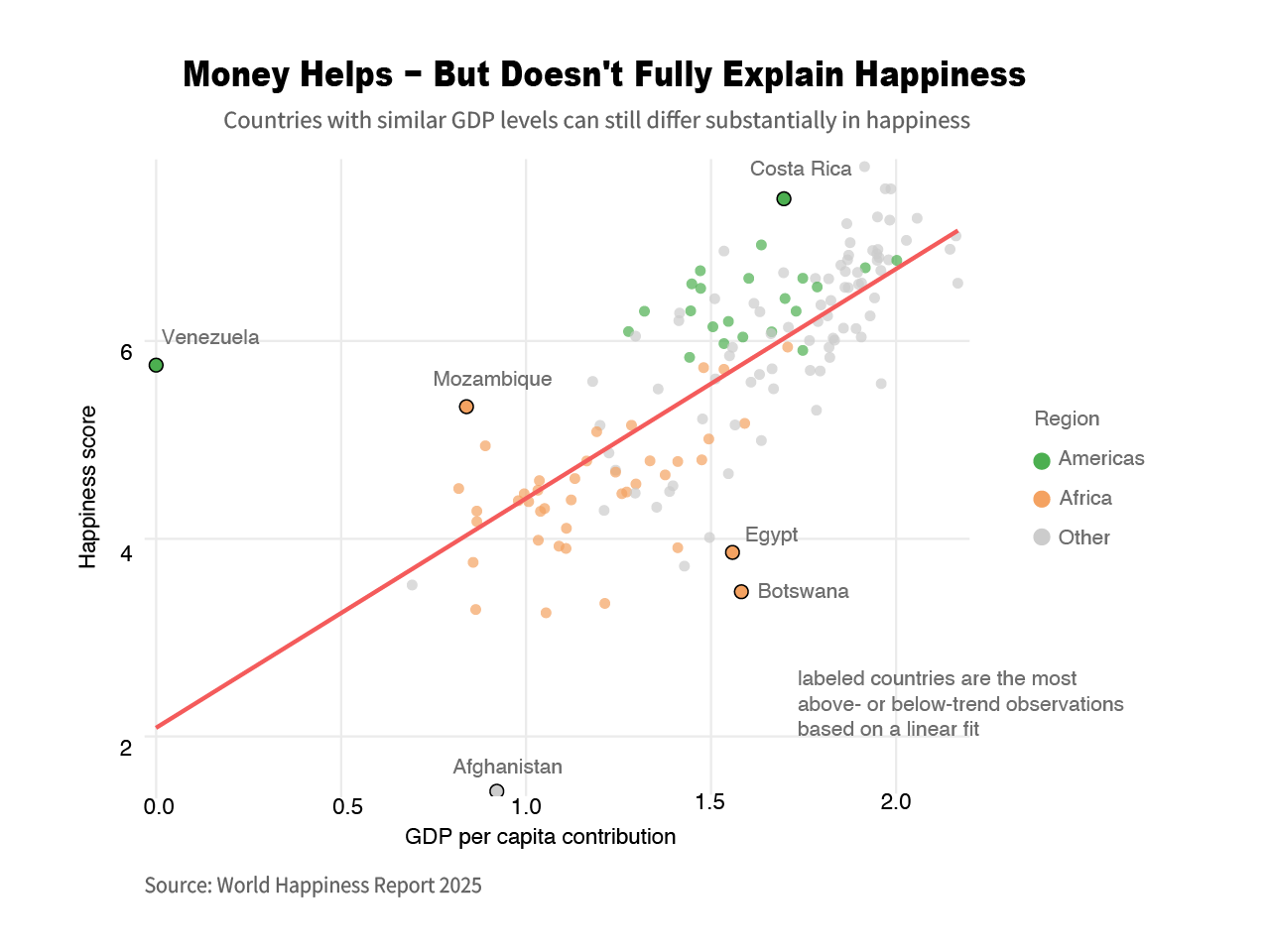
As we can see from the first figure, countries with similar GDP can sit far apart on happiness. Figure 1 makes that tension clear—the cloud rises along the red fitted line (higher GDP tends to go with higher happiness), but the scatter around the line is too wide to dismiss. The labeled countries are the strongest above- or below-trend cases from that linear fit: Costa Rica sits well above the line (more happiness than its income would predict), while Afghanistan falls far below. That pattern fits how constraints work at the lower end of the distribution: limited fiscal capacity weakens public services, shocks hit harder, and households have fewer buffers, so many lower-GDP countries cluster on the left at lower happiness. There, extra national wealth can fund cleaner water, safer roads, and broader access to care—growth is not separate from well-being in policy terms, and rising income can improve concrete lived conditions, not only macro numbers.
The same figure also hints at diminishing automatic returns: once countries are materially secure, points spread more at similar income levels, so more GDP does not guarantee a proportional gain in happiness—which is why the next charts matter. Money is part of the architecture of happiness, but not the full blueprint.
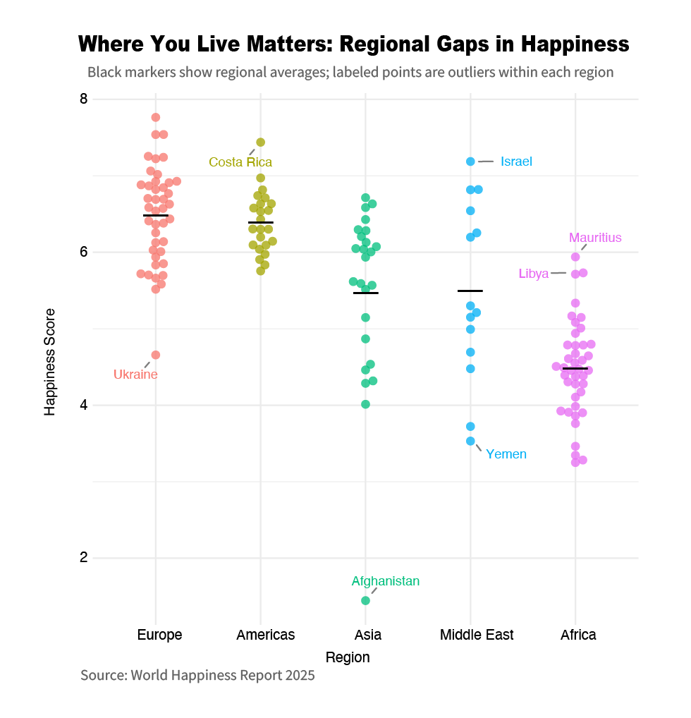
The second finding is the one that complicates simple narratives. Once countries reach higher income levels, gains in happiness often depend more on social trust, institutional quality, health outcomes, and perceived freedom. Figure 2 shifts the view away from GDP and toward regional context: each colored dot is a country’s happiness score, and the black markers show regional averages. Differences in the height and spread of each region’s distribution show that where you live—and how stable your region is—can shape baseline well-being.
The chart also labels outliers within each region, making the story concrete: Ukraine sits well below most of Europe; Costa Rica stands high within the Americas; Afghanistan is near the bottom of Asia; in the Middle East, Israel is high while Yemen is low; and in Africa, Mauritius is high while Libya is marked as a notable deviation. These points are policy clues: predictable institutions, stronger social support, and lower conflict risk can lift a country above its regional baseline, while instability and service breakdown can sharply depress it.
This is where the narrative becomes more policy-relevant. If wealth were the whole answer, we would not see such pronounced within-region gaps and outliers. Figure 2 reframes the question from "who is richest" to "who turns resources into stability and lived dignity"—growth matters, but governance quality and social trust help determine the ceiling.
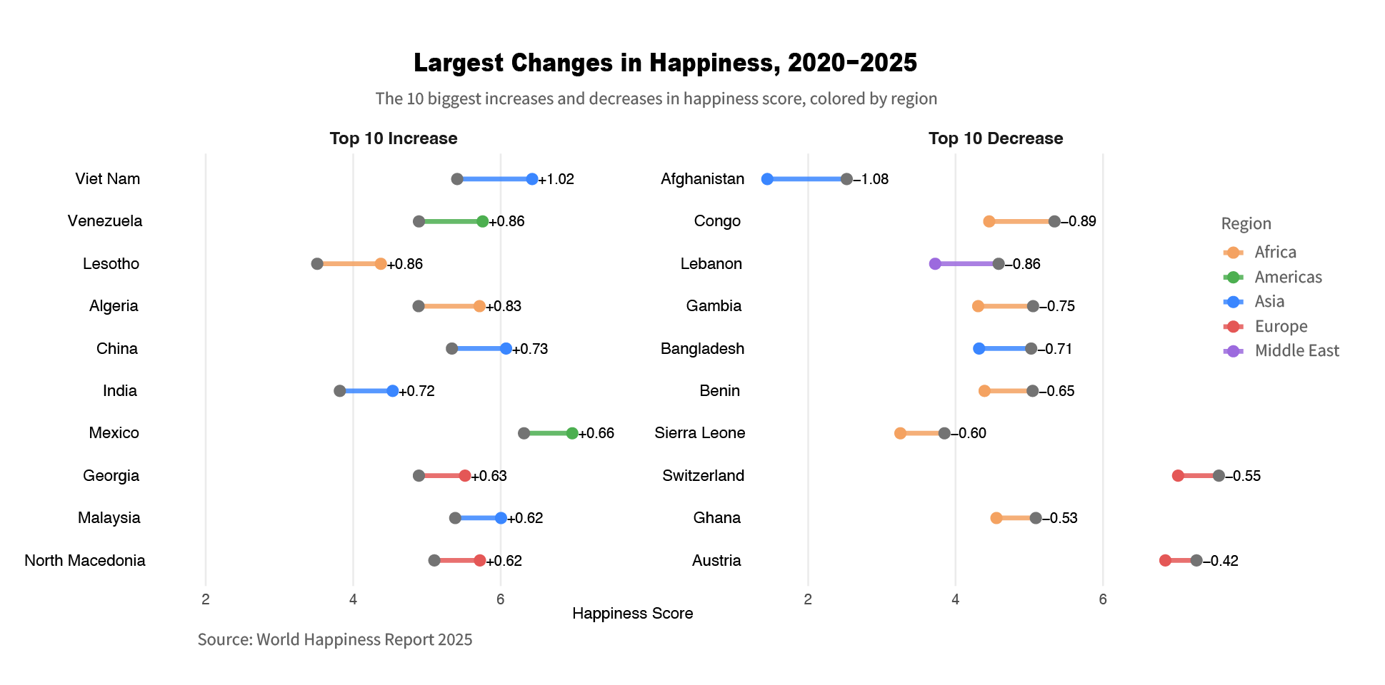
The most important analytical move is to look at change. Figure 3 highlights the countries with the largest shifts in happiness—Top 10 increases on the left and Top 10 decreases on the right—using a dumbbell design (a gray point connected to a colored point) to show movement between two periods. Points are colored by region (Africa, Americas, Asia, Europe, Middle East), making it easy to see not just direction and magnitude, but also where big changes cluster geographically.
In Figure 3, each country appears as a pair of points: an earlier score in gray and a later score in color, joined by a line. The left panel lists the 10 largest increases, and the right panel lists the 10 largest decreases; the length of each connector shows how big the change is between the two periods. Color encodes region, so you can quickly see which regions the biggest jumps and drop-offs come from while reading the exact start (gray) and end (colored) positions for each country.

So, does money buy happiness? Figure 1 shows a strong income–happiness link, but also big deviations. Figure 2 shows regional baselines and sharp within-region gaps. Figure 3 shows that happiness can shift quickly with risk, governance, and expectations. World Happiness Report data helps separate myth from pattern. The takeaway is a dual agenda: grow inclusive prosperity where scarcity dominates, and invest in trust, health, and social support that turn wealth into everyday stability.